Hitler se entera de que no hay pruebas de usabilidad (en español)
Hitler finds out there are no usability tests
I know, I know; it's not very original but... I couldn't avoid it.
I know, I know; it's not very original but... I couldn't avoid it.
This time, the proposal is for a set of usability heuristics specifically compiled for rich internet applications (RIA), whose interfaces currently lack a standard set of principles or best practices.
 Rich Internet applications (RIA) (or ‘web applications’ as opposed to ‘web pages’) are very common nowadays; they may come from a standard web page that has been improved with extra functionalities, or from a desktop application that has been migrated towards a web platform. In any case, there are very few well-established standards for that kind of interfaces.
That’s why I have compiled a list of RIA-specific usability heuristics (or best practices) that may help when it comes time to develop or to evaluate a rich web application. They are not intended to fully cover all the aspects of the application, but to address issues specific of rich web interfaces; these heuristics should be a complement of more general ones.
As with the psychological usability heuristics, they are in the form of a Google Docs spreadsheet to make it easy to download or clone it for your own work.
RIA Usability Heuristics spreadsheet (Google Docs)
These are some of the sources I have used to compile the heuristics (thanks to them!):
What do you think of those heuristics? Do you know any other?
Yes, they are.
Definition of usability by ISO 9241:
“The extent to which a product can be used by specified users to achieve specified goals with effectiveness, efficiency, and satisfaction in a specified context of use.”
QED
Members of the research community have now a way of pledging to assist only for congresses and journals that make their publications available on the web for free. Researches from institutions like Google, Microsoft and important universities have already subscribed.
‘Investigación sin paredes’, en español.
When you enter the academic world, you realize of one surprising thing: it’s a rather opaque world. In fact, many of the most prestigious journals make their publications only available to subscripters, so the only part that is available on the web for free are their abstracts.
So in the era of Internet and free access to information, scientific knowledge obtained through research (which should be the paradigm of free access to knowledge) depends mostly on an previous outlay.
At least until now. The Research Without Walls movement allows the research community to pledge to assist in the peer review process only for conferences and journals that make their accepted publications available to the public for free via the web.
Right now, the number of subscribers is not very large, but the list of institutions they belong to is pretty impressive: Google, Microsoft, Berkeley University, etc. And their prestige is important, since the reputation of conferences and journals is mostly determined by the researches that assist in them. The fact that they refuse to collaborate with closed-access publications may be a great boost to the free access to academic contents on the web.
UX Interpretations could be a useful technique to translate common poorly-specified requirements into a more UX friendly format.
 Some User-Centered Design techniques are supposed to be conducted during the requirements phase of the software development life-cycle, but in most real-world projects the usability/UX team cannot perform them, usually for reasons like these:
Yes, we know that the UX team should participate since the early stages of the development, but… what can we do when we are faced to given requirements, which are usually incomplete, long lists of technical features, and which have nothing to do with UCD techniques like use cases or user stories?
Last June, Greg Lauger explained in his article ‘Matching Requirements with User Experience‘ on Johnny Holland Magazine some techniques used in that kind of situations, and I think that the ‘UX Interpretation‘ approach (he calls it a “collaborative clarification”) is a great idea and could be used as a UCD technique on its own.
This is a proposal for a set of usability heuristics coming from known psychological facts about the human mind, including a spreadsheet that may be used in practical heuristic evaluations.
 Some time ago, Susan Weinschenk (@thebrainlady in Twitter) wrote about the psychologist view of UX design, listing a number of facts discovered by psychology about the human mind that may be directly applied to interfaces design. And I think that’s an important point; although usability experts try to put the user in the center of every step through the design process, principles and best practices are usually referred to technical aspects of the development of interfaces. That’s what happens with most of the principles used when evaluating interfaces in heuristic evaluations.
So… why don’t we use those psychological facts as heuristic principles when evaluating interfaces, instead of the typical technical ones? To that end, I have translated Susan’s points into heuristic principles and checkpoints that may be used to evaluate interfaces, creating a spreadsheet to make evaluations easier. Here you have it:
Psychological Usability Heuristics spreadsheet (Google Docs)
Of course, the translation of facts into heuristics is subjective, and this work may be updated and/or expanded at any time; anyway, I think this may be a good approach to usability from a more human perspective.
Feel free to use this spreadsheet for your own work (you may have to download or make a copy before). Any feedback about this work will be welcome!
I have contacted Susan Weinschenk explaining her this idea, and this is her kind reply:
Hi Jordi,
Thanks for writing.
It’s a very interesting idea. I’m surprised I didn’t think of it myself!
Have you read my book: 100 Things Every Designer Needs To Know About People? Probably more ideas in there too.
Susan
I haven’t read ‘100 Things‘ (yet), but I have read her previous book and multiple articles in her blog. I wonder if 100 things may lead to 100 heuristic principles. It seems like a lot of work for me alone; maybe if this first idea achieves some success…
Applying usability techniques during a development process that is already underway and little known may be really hard. Below I suggest a few techniques so as to "board the boat" in an effective way.

Jakob Nielsen defined guerrilla HCI as a collection of usability techniques that may be performed along development projects in an informal and fast way, requiring few resources, getting acceptable results and avoiding the intimidation barrier of using that kind of techniques.
One advantage of guerrilla HCI is that it can be performed without great involvement of the development team, and consequently, it is useful in traditional website development.
According to their own nature, websites must be self-explanatory and their interface must follow existing standards in order to make possible that anyone can use it without advanced skills neither previous training.
For example, guerrilla HCI could be perfectly applied in the evaluation of an e-commerce website or one belonging to a university since, in principle, they don’t require special knowledge.
Nevertheless, there are cases where it’s not that simple… (more…)
Just one. But she would have to:
User Centered Design (UCD) is a topic becoming more popular day by day, it's more a set of good intentions than a well-defined process applicable to any development project.
Este artículo está también disponible en español.
User Centered Design (UCD) seems to be growing in popularity, and it’s not strange. Who could be against the user being the center of the design process? But looking beyond this popularity it turns out that there is not a consensus about what UCD is.
Formal definitions like in Wikipedia or ISO 13407:1999 describe it vaguely using terms as “design philosophies”, “models”, “general guidelines”, “recommendations”, … All those are positive instructions, but they aren’t really useful when you face a real project developing a real interface.
 User Centered Design is something as generic as this figure, according to ISO 13407.
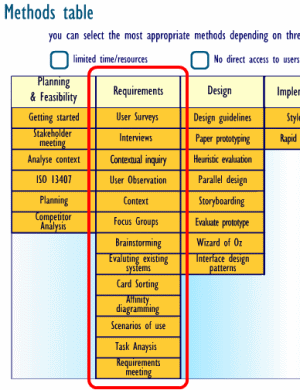
Actually UCD refers almost always to a set of techniques that may be applied along all the life-cycle of a software application; the only thing those techniques have in common is that users are their main roles (at least theoretically). The number of techniques included may vary from six (like in this Webcredible article) to several tens (like in this interactive table at UsabilityNet). Those techniques may be as different between them as focus groups, user testing and interface prototyping.
Oddly some UCD techniques don’t include real users in their carrying out: for example, heuristic evaluations of usability.