From UX heuristics to an application for evaluations: user roles

Using a compilation of UX heuristics as starting point, let's take the first step to create an application for evaluations: defining user roles.

From UX heuristics to an application for evaluations: user roles

(TL;DR: user roles at UX manager)

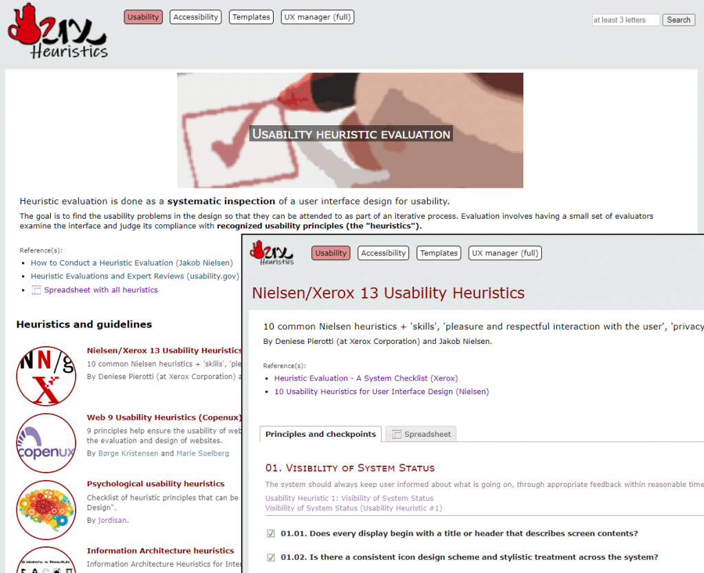
When we talk about usability heuristics, Nielsen always comes to mind; but they are not the only ones. At heuristics.uxmanager.net you have a compilation of usability heuristics, including some for specific cases like Single-Page Applications (SPA) or mobile, and even a set from a psychological point of view. All of them are also available as a spreadsheet so you can use them for your own evaluations.

Besides those heuristics, the website includes a collection of accessibility guidelines including WCAG 2.1, all of them also as spreadsheets. Although they are usually considered as different techniques, in practice both usability heuristic evaluations and accessibility evaluations are similar in essence (i.e., checking if an interface accomplishes a set of principles), and even the specialists that perform them are many times the same.

So we have a compilation of usability heuristics and accessibility guidelines, and even spreadsheets to use them for evaluations; what else can we do with them?

(more…)

‘We are not good at designing’ (or why users are black swans)

That is one of the ideas from Nassim Taleb, author of "The Black Swan", that may be also applied to the design of interfaces.

Listen Nassim Taleb in this interview (minute 4) claiming that humans are bad designers:

In his most popular book, “The Black Swan” (nothing to do with the movie), Taleb explains that many disciplines allegedly scientific like sociology, meteorology, politics and especially economics, are so complex and are so hugely affected by single events impossible to foresee (“black swans”), that making valid predictions is useless in most cases. Worse still, we are unaware of how bad we are making predictions.

Obviously, Taleb is not talking specifically about interface design, but it’s inevitable to come to the same conclusion because it’s also true that we are not good at designing interfaces. That’s why every approach to User-Centered Design is iterative: we know we are not going to find a suitable solution at first, so we keep trying and refining until we reach a valid design (because “we are good at discovering things”).

And what are our black swans? Users: it’s impossible to foresee how users are going to react in front of an interface (anyone who has performed or watched a usability user test has realized).

(more…)

Software testing and usability: so close, so far

Software testing and usability are usually seen as independent fields, but they seem to have many common aspects. Why not trying to integrate both of them?

In my previous job as an expert in usability and accessibility, I was a member of the Software Quality Area inside my company. There I realized that, although they are closely related, usability and software testing are, in practice, developed as totally independent disciplines, with:Usability and software testing, working together

  • different experts and teams
  • different methodologies and techniques
  • different tools

Couldn’t they be more integrated?

(more…)

UX thoughts visiting a NASA exhibition

A user-centered design vision of a visit to a NASA exhibition.

Last week I was visiting a NASA exhibition in Madrid. As a usability/UX specialist, I was prepared to see complex interfaces and panels full of buttons; and they were there. But two other things related to UX were called to my attention.

First, prototypes. One of the items at the exhibition was a sequence of prototypes of the lunar module that landed on the moon during the Apollo missions.

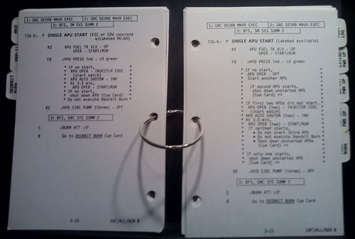
Second, checklists. Several old-fashioned paper checklists used during space missions were shown.

 Checklist used during a NASA space mission

I don’t know whether checklists are generally considered as a usability or user-centered design technique; anyway, I think they should. For more considerations about that technique, read the surprising and interesting book The Checklist Manifesto.

So two conclusions came to my mind:

  • When we talk about usability methods, it may seem that they are some kind of magic trick or very advanced technique; but most of them are simple and based upon common sense. And they have been performed during many years.
  • Since those kind of techniques have been performed during many years, and (most of) the missions were successful… hey, they somehow work!

RIA (Rich Internet Applications) usability heuristics

This time, the proposal is for a set of usability heuristics specifically compiled for rich internet applications (RIA), whose interfaces currently lack a standard set of principles or best practices.

RIA (Rich Internet Applications) technologiesRich Internet applications (RIA) (or ‘web applications’ as opposed to ‘web pages’) are very common nowadays; they may come from a standard web page that has been improved with extra functionalities, or from a desktop application that has been migrated towards a web platform. In any case, there are very few well-established standards for that kind of interfaces.

That’s why I have compiled a list of RIA-specific usability heuristics (or best practices) that may help when it comes time to develop or to evaluate a rich web application. They are not intended to fully cover all the aspects of the application, but to address issues specific of rich web interfaces; these heuristics should be a complement of more general ones.

As with the psychological usability heuristics, they are in the form of a Google Docs spreadsheet to make it easy to download or clone it for your own work.

RIA Usability Heuristics spreadsheet (Google Docs)

These are some of the sources I have used to compile the heuristics (thanks to them!):

What do you think of those heuristics? Do you know any other?

Give me back my text labels, GMail!

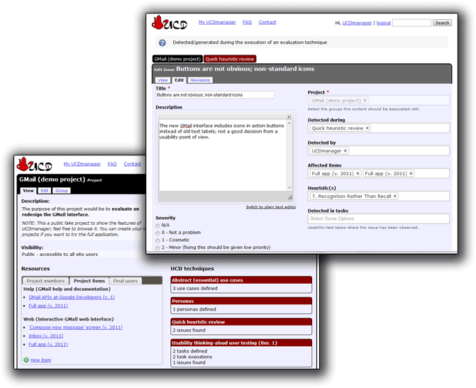
The new GMail interface includes icons in action buttons instead of old text labels; not a good decision from a usability point of view.

A lot has been written about the new GMail interface; most of it is a matter of opinion, but I’m afraid Google has committed an obvious mistake: using icons (in buttons) that don’t have a clear single meaning.

Let’s take a look at two of the buttons; isn’t this your first guess when you see them?

Guess for two of the buttons in new Gmail interface: download? important? 

Wrong. The real functions of those buttons are:

Real meaning of the icons: archive and spam. 

Using fancy original self-designed icons is a common mistake made by novice interface designers; icons are hard to memorize, and users usually recognize just a few of the most common. Many times, the best way to describe a function is simply a text label.

I’m surprised Google has fallen into that error; maybe they have been paying too much attention to people complaining about their ugly interfaces. Anyway, Google, please, give me back my text labels for actions!