Defining personas for UX evaluations

After user roles, we define personas as prototypical users of a system for UX evaluations.

Defining personas for UX evaluations

(TL;DR: personas at UX manager)

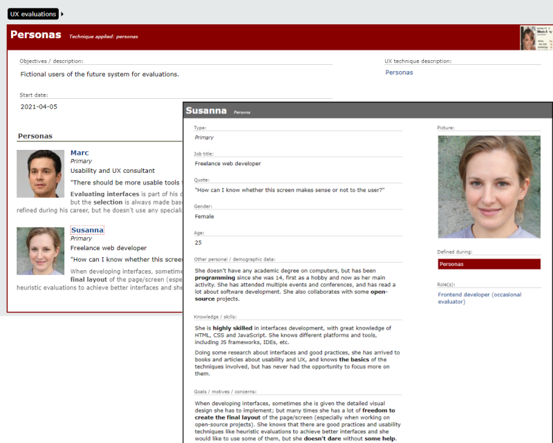
A persona is a description of an imaginary person who is an archetypical user of the system, and who may be used as a reference or inspiration when designing interfaces. Therefore, once we have defined the user roles involved in our system for UX evaluations, we can create some personas to make them more real.

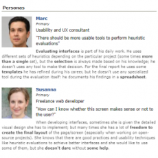
Since we selected usability experts and frontend developers (as occasional evaluators) as focal roles, we have defined two personas, one for each of them:

These are primary personas who would require a dedicated interface; we may define other secondary personas whose needs would be met by the same interfaces used by primary personas.

Here you have those two personas in PDF format:

Or better browse them online (as they might change in the future):

From UX heuristics to an application for evaluations: user roles

Using a compilation of UX heuristics as starting point, let's take the first step to create an application for evaluations: defining user roles.

From UX heuristics to an application for evaluations: user roles

(TL;DR: user roles at UX manager)

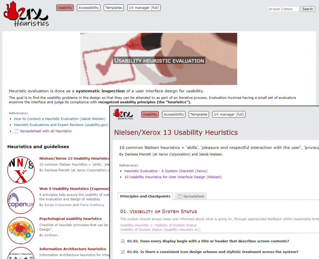
When we talk about usability heuristics, Nielsen always comes to mind; but they are not the only ones. At heuristics.uxmanager.net you have a compilation of usability heuristics, including some for specific cases like Single-Page Applications (SPA) or mobile, and even a set from a psychological point of view. All of them are also available as a spreadsheet so you can use them for your own evaluations.

Besides those heuristics, the website includes a collection of accessibility guidelines including WCAG 2.1, all of them also as spreadsheets. Although they are usually considered as different techniques, in practice both usability heuristic evaluations and accessibility evaluations are similar in essence (i.e., checking if an interface accomplishes a set of principles), and even the specialists that perform them are many times the same.

So we have a compilation of usability heuristics and accessibility guidelines, and even spreadsheets to use them for evaluations; what else can we do with them?

(more…)

Global translations in PrestaShop

A custom implementation to define translations that can be used in different PrestaShop theme templates and modules.

Global translations in PrestaShop

As you probably know if you are reading this, when using translations to different languages in PrestaShow their scope is just a single template (if they’re in a theme) or a single module (if they’re in a custom module). So… what if you want to create global translations which can be used in different templates and modules, and therefore avoid duplicated content and make maintenance easier? It seems there’s no native way to define them, so let’s try this implementation. (more…)

forUSE: usage-centered design (recovered)

Some articles about Usage-Centered Design by Constantine & Lockwood, recovered from their former forUSE website.

The usage-centered design approach to UX design (as defined by Constantine & Lockwood) has been always a reference to me. Their articles describe practical well-defined techniques which I think can (and should) be included in development processes, and my humble opinion is that it deserves more attention than it gets.

Usage-centered design itself has been viewed as providing already established and effective methods for putting activity-centered design into practice and for overcoming some of the stated shortcomings of human-centered design (Norman, 2006).

Actually, I used their descriptions of techniques for Personas, User Roles and (Abstract) Use Cases as the basis for their implementation into UCDmanager. One of the main reasons for this choice is that they set the basis for a design methodology which includes different interrelated techniques, instead of the toolbox of heterogeneous independent methods we usually have.

Sadly, it seems that their forUSE website is no longer active (although it still can be accessed through the Internet Archive’s Wayback Machine). That’s why I’m recovering here some of their articles. (more…)

An approach to an integrated software-releases workflow

Many organizations have their own process to develop and release software, but... how can they include testing and usability techniques in their workflows? Here's a first approach.

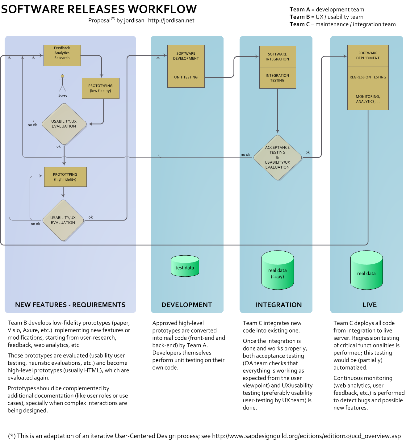
Some time ago I wrote about the similarities and relationships between testing and UX/usability techniques. But there’s another question: how do we integrate them in the software development process? Here’s an approach:

An approach to an integrated software-releases workflow

(more…)

‘We are not good at designing’ (or why users are black swans)

That is one of the ideas from Nassim Taleb, author of "The Black Swan", that may be also applied to the design of interfaces.

Listen Nassim Taleb in this interview (minute 4) claiming that humans are bad designers:

In his most popular book, “The Black Swan” (nothing to do with the movie), Taleb explains that many disciplines allegedly scientific like sociology, meteorology, politics and especially economics, are so complex and are so hugely affected by single events impossible to foresee (“black swans”), that making valid predictions is useless in most cases. Worse still, we are unaware of how bad we are making predictions.

Obviously, Taleb is not talking specifically about interface design, but it’s inevitable to come to the same conclusion because it’s also true that we are not good at designing interfaces. That’s why every approach to User-Centered Design is iterative: we know we are not going to find a suitable solution at first, so we keep trying and refining until we reach a valid design (because “we are good at discovering things”).

And what are our black swans? Users: it’s impossible to foresee how users are going to react in front of an interface (anyone who has performed or watched a usability user test has realized).

(more…)

Software testing and usability: so close, so far

Software testing and usability are usually seen as independent fields, but they seem to have many common aspects. Why not trying to integrate both of them?

In my previous job as an expert in usability and accessibility, I was a member of the Software Quality Area inside my company. There I realized that, although they are closely related, usability and software testing are, in practice, developed as totally independent disciplines, with:Usability and software testing, working together

  • different experts and teams
  • different methodologies and techniques
  • different tools

Couldn’t they be more integrated?

(more…)

UX thoughts visiting a NASA exhibition

A user-centered design vision of a visit to a NASA exhibition.

Last week I was visiting a NASA exhibition in Madrid. As a usability/UX specialist, I was prepared to see complex interfaces and panels full of buttons; and they were there. But two other things related to UX were called to my attention.

First, prototypes. One of the items at the exhibition was a sequence of prototypes of the lunar module that landed on the moon during the Apollo missions.

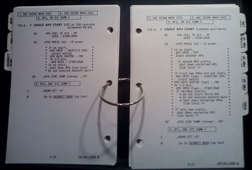
Second, checklists. Several old-fashioned paper checklists used during space missions were shown.

 Checklist used during a NASA space mission

I don’t know whether checklists are generally considered as a usability or user-centered design technique; anyway, I think they should. For more considerations about that technique, read the surprising and interesting book The Checklist Manifesto.

So two conclusions came to my mind:

  • When we talk about usability methods, it may seem that they are some kind of magic trick or very advanced technique; but most of them are simple and based upon common sense. And they have been performed during many years.
  • Since those kind of techniques have been performed during many years, and (most of) the missions were successful… hey, they somehow work!