From UX heuristics to an application for evaluations: user roles

Using a compilation of UX heuristics as starting point, let's take the first step to create an application for evaluations: defining user roles.

From UX heuristics to an application for evaluations: user roles

(TL;DR: user roles at UX manager)

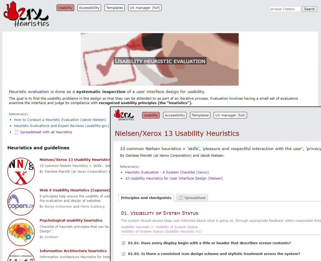
When we talk about usability heuristics, Nielsen always comes to mind; but they are not the only ones. At heuristics.uxmanager.net you have a compilation of usability heuristics, including some for specific cases like Single-Page Applications (SPA) or mobile, and even a set from a psychological point of view. All of them are also available as a spreadsheet so you can use them for your own evaluations.

Besides those heuristics, the website includes a collection of accessibility guidelines including WCAG 2.1, all of them also as spreadsheets. Although they are usually considered as different techniques, in practice both usability heuristic evaluations and accessibility evaluations are similar in essence (i.e., checking if an interface accomplishes a set of principles), and even the specialists that perform them are many times the same.

So we have a compilation of usability heuristics and accessibility guidelines, and even spreadsheets to use them for evaluations; what else can we do with them?

(more…)

‘We are not good at designing’ (or why users are black swans)

That is one of the ideas from Nassim Taleb, author of "The Black Swan", that may be also applied to the design of interfaces.

Listen Nassim Taleb in this interview (minute 4) claiming that humans are bad designers:

In his most popular book, “The Black Swan” (nothing to do with the movie), Taleb explains that many disciplines allegedly scientific like sociology, meteorology, politics and especially economics, are so complex and are so hugely affected by single events impossible to foresee (“black swans”), that making valid predictions is useless in most cases. Worse still, we are unaware of how bad we are making predictions.

Obviously, Taleb is not talking specifically about interface design, but it’s inevitable to come to the same conclusion because it’s also true that we are not good at designing interfaces. That’s why every approach to User-Centered Design is iterative: we know we are not going to find a suitable solution at first, so we keep trying and refining until we reach a valid design (because “we are good at discovering things”).

And what are our black swans? Users: it’s impossible to foresee how users are going to react in front of an interface (anyone who has performed or watched a usability user test has realized).

(more…)

RIA (Rich Internet Applications) usability heuristics

This time, the proposal is for a set of usability heuristics specifically compiled for rich internet applications (RIA), whose interfaces currently lack a standard set of principles or best practices.

RIA (Rich Internet Applications) technologiesRich Internet applications (RIA) (or ‘web applications’ as opposed to ‘web pages’) are very common nowadays; they may come from a standard web page that has been improved with extra functionalities, or from a desktop application that has been migrated towards a web platform. In any case, there are very few well-established standards for that kind of interfaces.

That’s why I have compiled a list of RIA-specific usability heuristics (or best practices) that may help when it comes time to develop or to evaluate a rich web application. They are not intended to fully cover all the aspects of the application, but to address issues specific of rich web interfaces; these heuristics should be a complement of more general ones.

As with the psychological usability heuristics, they are in the form of a Google Docs spreadsheet to make it easy to download or clone it for your own work.

RIA Usability Heuristics spreadsheet (Google Docs)

These are some of the sources I have used to compile the heuristics (thanks to them!):

What do you think of those heuristics? Do you know any other?

Psychological usability heuristics

This is a proposal for a set of usability heuristics coming from known psychological facts about the human mind, including a spreadsheet that may be used in practical heuristic evaluations.

Psychology and usabilitySome time ago, Susan Weinschenk (@thebrainlady in Twitter) wrote about the psychologist view of UX design, listing a number of facts discovered by psychology about the human mind that may be directly applied to interfaces design. And I think that’s an important point; although usability experts try to put the user in the center of every step through the design process, principles and best practices are usually referred to technical aspects of the development of interfaces. That’s what happens with most of the principles used when evaluating interfaces in heuristic evaluations.

So… why don’t we use those psychological facts as heuristic principles when evaluating interfaces, instead of the typical technical ones? To that end, I have translated Susan’s points into heuristic principles and checkpoints that may be used to evaluate interfaces, creating a spreadsheet to make evaluations easier. Here you have it:

Psychological Usability Heuristics spreadsheet (Google Docs)

Of course, the translation of facts into heuristics is subjective, and this work may be updated and/or expanded at any time; anyway, I think this may be a good approach to usability from a more human perspective.

Feel free to use this spreadsheet for your own work (you may have to download or make a copy before). Any feedback about this work will be welcome!

Update 19-sep-2011

I have contacted Susan Weinschenk explaining her this idea, and this is her kind reply:

Hi Jordi,
Thanks for writing.
It’s a very interesting idea. I’m surprised I didn’t think of it myself!
Have you read my book: 100 Things Every Designer Needs To Know About People? Probably more ideas in there too.
Susan

I haven’t read ‘100 Things‘ (yet), but I have read her previous book and multiple articles in her blog. I wonder if 100 things may lead to 100 heuristic principles. It seems like a lot of work for me alone; maybe if this first idea achieves some success…
Ship-boarding usability

Applying usability techniques during a development process that is already underway and little known may be really hard. Below I suggest a few techniques so as to "board the boat" in an effective way.

Disponible también en español

Board the ship (detail)

Jakob Nielsen defined guerrilla HCI as a collection of usability techniques that may be performed along development projects in an informal and fast way, requiring few resources, getting acceptable results and avoiding the intimidation barrier of using that kind of techniques.

One advantage of guerrilla HCI is that it can be performed without great involvement of the development team, and consequently, it is useful in traditional website development.

According to their own nature, websites must be self-explanatory and their interface must follow existing standards in order to make possible that anyone can use it without advanced skills neither previous training.

For example, guerrilla HCI could be perfectly applied in the evaluation of an e-commerce website or one belonging to a university since, in principle, they don’t require special knowledge.

Nevertheless, there are cases where it’s not that simple… (more…)

‘Top lists’ as heuristics for simple usability evaluations

Heuristic usability evaluations are a discount usability engineering method for quick, cheap and easy evaluation of interfaces; but if you can't or don't dare to apply usual heuristics, here's an alternative: 'top lists'.

Heuristic evaluation is one of the most popular usability techniques; it basically consists of reviewing an interface and check if it fulfills some well-known guidelines and principles (the “heuristics”).

Once you overcome the fear of performing a task with such a fancy name, the following step is obvious: choosing the heuristics (guidelines) to use. There are some popular heuristics lists, but there are some risks when using them for a usability evaluation:

  • If the heuristics are too generic, they don’t help you to identify real issues.
  • Otherwise, if the heuristics include detailed checkpoints, you may concentrate on small or very specific issues while overlooking the important ones.

Consequently I suggest using alternative heuristics: the ‘top lists’.

Which lists?

With ‘top lists’ I am referring to lists similar to these by Jakob Nielsen:Web mistakes (by Jacob Nielsen) 

I think this kind of guidelines might be used (or the mistakes avoided) in small projects, or even in big projects as a preliminar evaluation, or in other situations.

(more…)