Sometimes I have looked for an usability logo or icon, without luck. Hmmm, interesting! We have icons for almost every other issue, but why not for usability?
Let me suggest these:


Ok, usability specialists know icons and logos are overused in many sites, and they’re not really important for the user; it should be so natural than there’s no need to say “we care for usability”. Anyway, I think it would be a good idea having a logo to identify sites related to usability aspects, or maybe to identify sites that specially care about those issues.
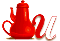
The teapot is from Don Norman’s book ‘The Design of Everyday Things‘, and it’s sometimes used (with different designs) in presentations, web sites, etc. The ‘u’ is supposed to be the handle of the teapot so as to make it more usable. Wait! It’s not a great logo if I have to explain this 🙂
You get the idea, don’t you? Now, remember I’m not a graphic designer and leave your opinions in the comments (and feel free to use them if you want to, of course).
